AI Design Cinematic: Why Every Website Looks the Same
AI coding agents often fall back to familiar web-design patterns. Here's how project rules can push them toward genuinely distinctive interfaces.
By singamankitha
Source: https://prod.cursor.com/docs/rules?utm_source=chatgpt.com
AI Design Cinematic: Why Every Website Looks the Same
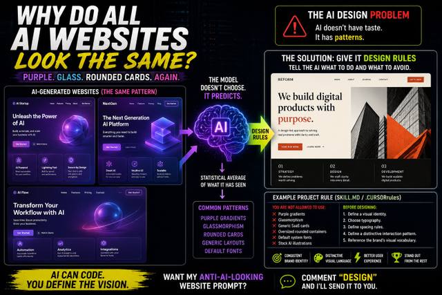
Why does an AI-generated website so often look like the last ten AI-generated websites you saw? Purple gradients. Glass cards. Huge rounded corners. Inter-style typography. A centered hero. Three feature cards. And another “Transform your workflow” headline. There is a reason this keeps happening — and developers are finding a practical way to fight it.
You ask an AI coding agent to build a website.
You give it a simple instruction:
“Make it modern, premium and professional.”
A few seconds later, you get a website.
It looks good.
At first.
Then you notice something.
You've seen it before.
The purple gradient.
The floating glass cards.
The giant rounded buttons.
The centered hero section.
The same three-column feature grid.
The same generic SaaS language.
So you try another AI tool.
Different prompt.
Different model.
Different project.
And somehow...
the website looks almost the same.
This has become one of the most interesting complaints about AI-assisted web development.
Developers are increasingly calling out a kind of visual sameness in AI-generated interfaces, with community discussions pointing to recurring patterns such as purple gradients, glassmorphism, generic cards and predictable layouts.
The good news?
You can fight it.
And the solution isn't simply:
“Tell the AI to be more creative.”
The AI Design Default
Modern AI coding agents are extremely good at producing functional interfaces.
Ask an agent to create a landing page and it can generate:
HTML.
CSS.
React components.
Responsive layouts.
Animations.
Forms.
Navigation.
Buttons.
Cards.
It can build an entire interface surprisingly quickly.
But functional doesn't automatically mean distinctive.
When you give an AI vague instructions such as:
“Make it modern.”
“Make it clean.”
“Make it premium.”
the model has to decide what those words mean visually.
And that's where the defaults appear.
Modern often becomes:
Purple gradient.
Clean becomes:
Lots of whitespace + rounded cards.
Premium becomes:
Dark background + glowing accents.
Professional becomes:
Inter + centered hero + three cards.
None of these choices are inherently bad.
The problem is that they are becoming predictable.
Why Does This Happen?
Large language models learn from enormous amounts of existing material.
When generating a website, the model has learned patterns about how websites are commonly structured.
That includes common:
Layouts
Typography
CSS patterns
Component structures
Color combinations
Design systems
Marketing language
UI components
If you don't provide strong creative direction, the agent has to make decisions based on what is most familiar and likely to work.
That's why the output can converge toward common web patterns.
A recent developer discussion described the problem almost perfectly: AI-generated sites repeatedly produced the same “purple gradient hero, rounded cards, glassmorphism” aesthetic until the developer introduced explicit design rules.
This doesn't mean the model literally calculates an average website.
It's better understood as pattern reproduction under vague instructions.
The AI knows what a typical modern SaaS website looks like.
So when you ask for “a modern SaaS website,” it gives you one.
The Purple Gradient Problem
There is nothing wrong with purple.
Purple can be an excellent brand color.
Gradients can be beautiful.
Glassmorphism can be useful.
Rounded cards can work extremely well.
The problem begins when every project uses them.
Imagine opening five websites:
Website 1:
Purple gradient.
Website 2:
Purple gradient.
Website 3:
Blue-purple gradient.
Website 4:
Dark background + purple glow.
Website 5:
Purple glass cards.
At some point, the visual language stops communicating the identity of the product.
It communicates something else:
“This was generated by an AI coding tool.”
That's the problem.
AI Doesn't Automatically Have Taste
Here's the more useful way to think about it:
AI can generate design decisions.
But it doesn't automatically know which design decisions are appropriate for your brand.
If you say:
“Build a premium website.”
that's not a design direction.
It's a vague objective.
A designer would normally ask:
What is the brand?
Who is the audience?
What emotion should the site create?
What brands should it feel related to?
What should it absolutely avoid?
What typography fits the personality?
How dense should the interface be?
What visual language should repeat?
What interaction should make the product memorable?
AI coding agents need that information too.
Give the AI a Design System
This is where project rules become powerful.
Instead of giving the AI a giant design instruction every time you ask it to create something, you can store persistent instructions inside the project.
Cursor's current documentation supports Project Rules stored under .cursor/rules, as well as AGENTS.md files for reusable project-level instructions. Cursor says these rules provide persistent context for the Agent and can be scoped to particular parts of a codebase.
The concept is simple:
Don't repeatedly tell the AI how your product should look.
Write the rules once.
Then let the agent use them throughout the project.
The Anti-AI Design Rule
Here's a simple example.
Instead of saying:
“Make the website unique.”
give the agent actual constraints.
For example:
# Visual Direction

The website must feel editorial, confident and unconventional.

Do not use:
- Purple gradients
- Generic glassmorphism
- Generic SaaS card grids
- Oversized rounded containers
- Default system typography
- Generic hero sections
- Stock-style AI illustrations
- Random decorative blobs

Before writing UI code:

1. Define the visual identity.
2. Choose a deliberate typography system.
3. Define the primary and secondary color palette.
4. Establish spacing and density rules.
5. Define the layout philosophy.
6. Define one distinctive interaction pattern.
7. Explain why each major visual decision fits the brand.

Prefer:
- Asymmetric layouts
- Strong typographic hierarchy
- Context-specific imagery
- Intentional whitespace
- Distinctive navigation
- Brand-specific interactions
- Visual hierarchy over decoration
That's dramatically more useful than:
“Make it look cool.”
Negative Rules Are Surprisingly Useful
One of the most interesting ideas from the current design-skill ecosystem is negative constraints.
Instead of only telling the AI what to do, tell it what not to do.
For example:
Never use purple gradients.
Never use three identical feature cards.
Never use Inter unless explicitly requested.
Never use a centered hero unless the content requires it.
Never use rounded containers larger than X radius.
Never add decorative elements without a functional reason.
These rules don't magically create great design.
But they can stop the model from immediately falling back to familiar defaults.
Several current frontend-design skills explicitly use this approach, banning common AI-generated aesthetics such as purple gradients, predictable layouts and cookie-cutter components.
But Banning Purple Isn't Enough
This is where a lot of people get the lesson wrong.
If you simply tell AI:
“Don't use purple.”
you haven't created a design.
You've just removed one color.
The AI might respond with:
Blue gradient.
Green gradient.
Orange gradient.
Same cards.
Same hero.
Same layout.
Same typography.
Congratulations.
You now have a blue AI website.
The real solution is positive art direction.
Tell AI What You Want Instead
For example:
Instead of:
“Don't use purple.”
say:
“Use a warm editorial palette inspired by printed magazines: off-white, charcoal, burnt orange and muted olive.”
Instead of:
“Don't use rounded cards.”
say:
“Use a newspaper-inspired modular layout with thin rules, strong typographic hierarchy and asymmetric content blocks.”
Instead of:
“Don't use generic fonts.”
say:
“Use a high-contrast serif display typeface for headlines and a restrained grotesk for interface elements.”
Now the AI has somewhere to go.
You're not simply blocking the defaults.
You're giving it a visual destination.
The Five Things Your AI Design Rule Should Define
If you want consistently better AI-generated interfaces, define at least five things.
1. Typography
Specify:
Display font
Body font
Font weights
Heading scale
Line height
Letter spacing
Don't simply say:
“Use good typography.”
Tell the AI what good means for your brand.
2. Color
Define:
Primary
Secondary
Background
Surface
Text
Accent
Error
Success
And explain how those colors should be used.
3. Layout
Define whether the site should be:
Editorial.
Minimal.
Dense.
Asymmetric.
Grid-based.
Brutalist.
Luxury.
Playful.
Technical.
The layout is part of the identity.
4. Components
Tell the AI what recurring components should look like.
Buttons.
Cards.
Navigation.
Forms.
Tables.
Modals.
Sections.
Don't let every component invent its own visual language.
5. Interaction
This is often forgotten.
Define one or two memorable interaction patterns.
For example:
Hover reveals.
Scroll-driven transitions.
Editorial image reveals.
Magnetic buttons.
Progressive disclosure.
Animated typography.
But don't add animations simply because AI can.
Interaction should serve the experience.
Use References
One of the easiest ways to improve AI-generated design is to provide references.
Instead of saying:
“Make it premium.”
say:
“Use the editorial density of a high-end magazine, the navigation simplicity of a modern documentation site and the typography hierarchy of a fashion publication.”
Now the AI has a direction.
You can also provide screenshots or visual references where your coding environment supports them.
The goal is to move from:
Abstract adjective
to:
Concrete visual vocabulary.
The Difference Between Prompting and Art Direction
This is the deeper lesson.
Prompting tells AI:
What to do.
Art direction tells AI:
How the result should feel.
Those aren't the same thing.
Consider these two prompts.
Prompt A
Build a premium landing page for an AI startup.
You'll probably get a familiar SaaS design.
Prompt B
Build a website for an AI research company that should feel like a serious scientific publication rather than a SaaS startup. Use dense editorial typography, monochrome photography, narrow text columns, asymmetric grids, thin rules, restrained color and data-driven visual elements. Avoid gradients, glassmorphism, oversized cards and generic startup illustrations.
That's a much stronger design brief.
The AI has constraints.
It has references.
It has a personality.
It has things to avoid.
Now it has a chance to produce something distinctive.
SKILL.md Can Make This Persistent
The growing ecosystem around SKILL.md files is particularly interesting because these files can package reusable instructions for AI coding agents.
Current frontend-design skills explicitly aim to stop agents from defaulting to common patterns such as purple gradients, Inter-like typography, predictable cards and generic SaaS layouts.
That means you can potentially create a reusable design skill once and apply it across projects.
Instead of starting every AI coding session with:
“Please don't make the website look generic.”
your project can already contain the rules.
That's a much better workflow.
Cursor Has Its Own Rule System
This isn't limited to one community hack.
Cursor officially supports reusable project rules through .cursor/rules.
According to Cursor's documentation, project rules can be version-controlled, scoped to your codebase and automatically included based on relevance. Cursor also supports AGENTS.md files for project instructions.
That means design rules can become part of the actual development environment.
Your repository can effectively tell the AI:
“This is how our product looks.”
Every time the agent works on the project, it has access to that context.
That's much closer to having a persistent design system.
The Real Goal Isn't “Make It Weird”
There is another trap.
Once people discover AI design repetition, they sometimes overcorrect.
They tell the AI:
“Make it crazy.”
Then they get:
Random animations.
Huge typography.
Five different fonts.
Unnecessary 3D objects.
Weird navigation.
Unusable layouts.
That's not distinctive design.
That's chaos.
Good design isn't about being different for the sake of being different.
It's about making deliberate decisions.
The objective should be:
Recognizable.
Not:
Random.
Before vs After
Here's the experiment you should actually run.
Version 1
Prompt:
Build a modern landing page for an AI productivity tool.
Save the result.
Version 2
Add a design rule:
Create an editorial visual identity with charcoal, cream and orange. Use a serif display typeface, asymmetric layouts, thin dividers and strong typographic hierarchy. No purple gradients, glassmorphism, generic SaaS cards or centered hero layouts.
Build the same page again.
Compare them.
That's where the lesson becomes obvious.
The second website isn't necessarily better because it uses orange.
It's better because the AI had a specific visual direction.
The Bigger Problem With Vibe Coding
Vibe coding has made software creation dramatically easier.
But it has created a new problem.
When everyone can generate a website quickly, the quality of the idea and design direction becomes more important.
The technical barrier falls.
The creative differentiation becomes harder.
If everyone uses the same AI tools with the same vague prompts, they can end up producing the same kinds of interfaces.
That's why design thinking becomes more important, not less.
AI can generate the implementation.
You still need to decide what the thing should feel like.
AI Gives You Speed — Not Taste
This may be the most useful sentence to remember:
AI gives you design velocity. It doesn't automatically give you design taste.
You can generate ten landing pages in an afternoon.
But if all ten use the same visual language, you've only generated ten variations of the same idea.
The advantage comes when you combine:
AI speed
Human art direction
Persistent design rules
Strong references
That combination is much harder to make generic.
The Future of AI Web Design
We're probably going to see more systems that treat design rules as first-class project context.
Instead of:
Prompt → Generate UI
the workflow becomes:
Brand system
↓
Design rules
↓
References
↓
AI coding agent
↓
Implementation
↓
Design review
↓
Iteration
That's much closer to how professional product teams work.
And it gives AI agents something they currently lack:
contextual taste constraints.
Final Takeaway
The problem isn't that AI-generated websites are bad.
The problem is that AI is extremely good at producing familiar solutions.
Give an AI coding agent a vague instruction like:
“Make a modern SaaS website.”
and you shouldn't be surprised when it reaches for familiar patterns.
Purple gradients.
Glass cards.
Rounded containers.
Centered heroes.
Generic typography.
Three-column feature sections.
Those patterns aren't inherently wrong.
They're just becoming predictable.
The practical solution is to give your AI coding agent a much stronger design brief — and, where supported, store those instructions in persistent project rules such as Cursor's .cursor/rules or AGENTS.md. Cursor officially supports these mechanisms for reusable project-level guidance.
And the growing SKILL.md ecosystem is taking the same concept further by packaging detailed frontend-design direction for coding agents.
So the next time your AI generates another:
purple gradient + glass cards + rounded SaaS dashboard...
don't just blame the model.
Look at your prompt.
Did you give it a visual identity?
Did you give it references?
Did you define typography?
Did you define spacing?
Did you define interaction?
Did you tell it what to avoid?
Because the future of AI web design probably isn't about getting AI to stop designing.
It's about getting AI to design with a point of view.
AI can write the code.
You still need to give the website a personality.